The Top 5 Bad Photo Editing Mistakes You Should Avoid
The Top 5 Bad Photo Editing Mistakes You Should Avoid – There’s a particular art to maximizing the potential of a photo to ensure you aren’t over-editing photos. Some people like to go to great lengths to process their photos using premium photo editing LUTS, while others stick with more simple editing styles and free photo editing tools. With anything today, there are great edits and not-so-great edits – or, to put it bluntly, bad photo editing. I want to give you my list of five photo-editing mistakes you should avoid when editing your next photos.
- Over-Saturation
- Staying in Color
- Overdoing the Details
- Overexposing or Underexposing
- Replacing Backgrounds
Photo-Editing Mistake #1: Over-Saturation
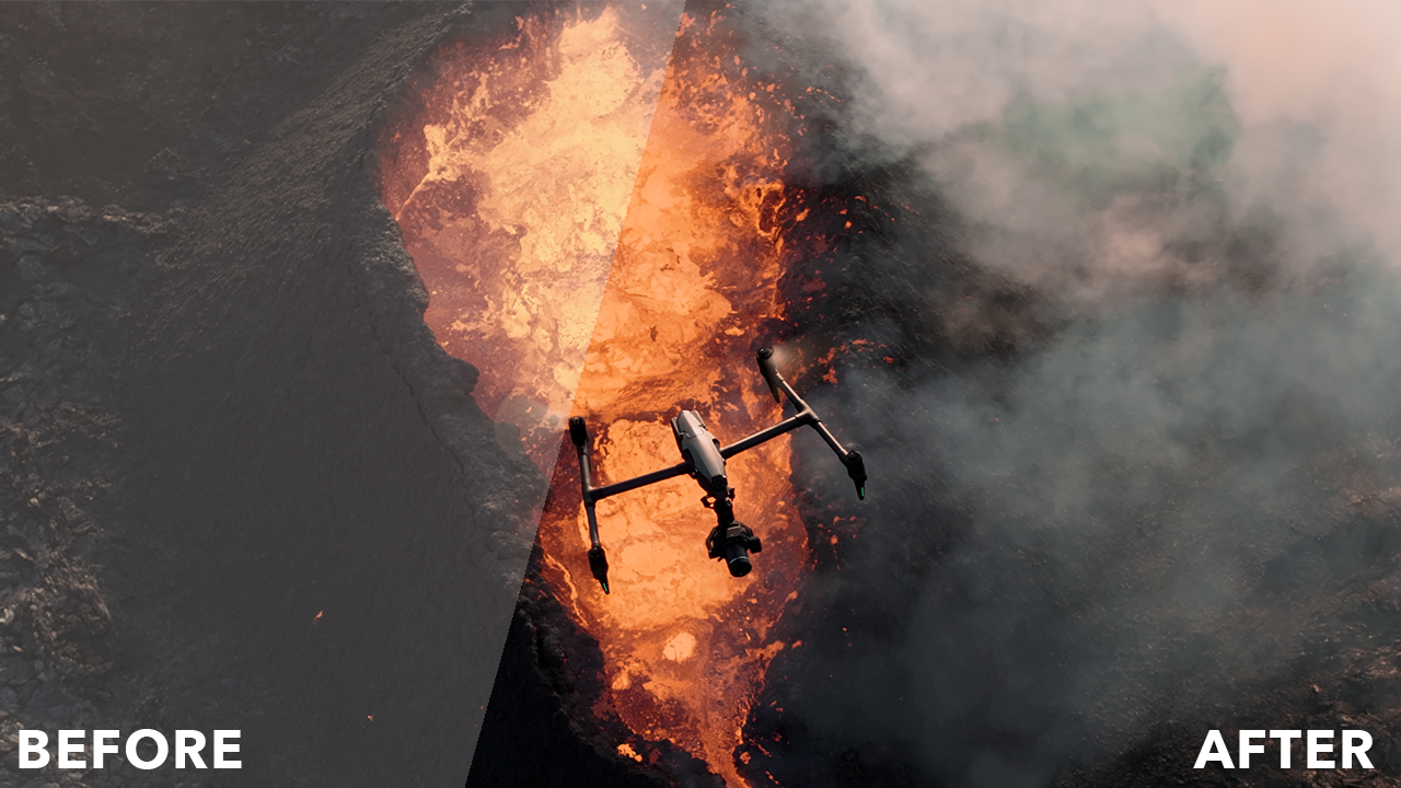
The first of many editing mistakes you should avoid when editing is to over-saturate. Over-saturating a photo can cause a lot of color distractions and make photos seem overly processed and fake. Too much color in a photo can distract your viewer, so it’s always smart to keep an eye on your saturation. Saturation can either make or break a photo. Take a sunset photo, for example.
There’s a huge difference when increasing the saturation to bring back some cloud color and make your beautiful scene look like it was processed in Microsoft® Paint. People often have a decent saturation of color in their photos straight from the camera, but they turn it up because everyone likes a little color boost. I know I do, I tend to increase the saturation most of the time I’m editing a photo.
However, I lower it to 0 when I’m dealing with saturation. Next time you want to modify the color saturation in your photo try dragging the slider to 0 and pause for a second. Look how beautiful it looks in black and white. Maybe it would look better that way, it doesn’t hurt to try. Right? Are you fiending for some color? Now grab that slider and stare at the photo itself, not the saturation control. Drag the slider back until you find the saturation adjustment you are looking for. I think you’ll be surprised at how little you need to make a big difference.
Too Much Saturation:

Zero Saturation:

The Right Amount of Saturation:

Photo-Editing Mistake #2: Staying in Color
Another thing about over-editing photos is that people don’t have to have color in their photos at all. The absence of color in photos can be remarkably helpful in increasing your photo’s contrast and tonality. Color can be distracting so desaturating it can remove distractions around your photo that may not be appealing to the viewer. Also, there is something so genuine and timeless about a black-and-white look on a photo.
A lot of the times when I convert my photo to black and white it’s when I can’t get the look I’m going for with color. Sometimes it takes me a while to figure out that I need to go monochromatic. Often I wish I had made it black and white in the beginning to see how it looked. Generally speaking, if your photo looks good in color, it will also look good in black and white.

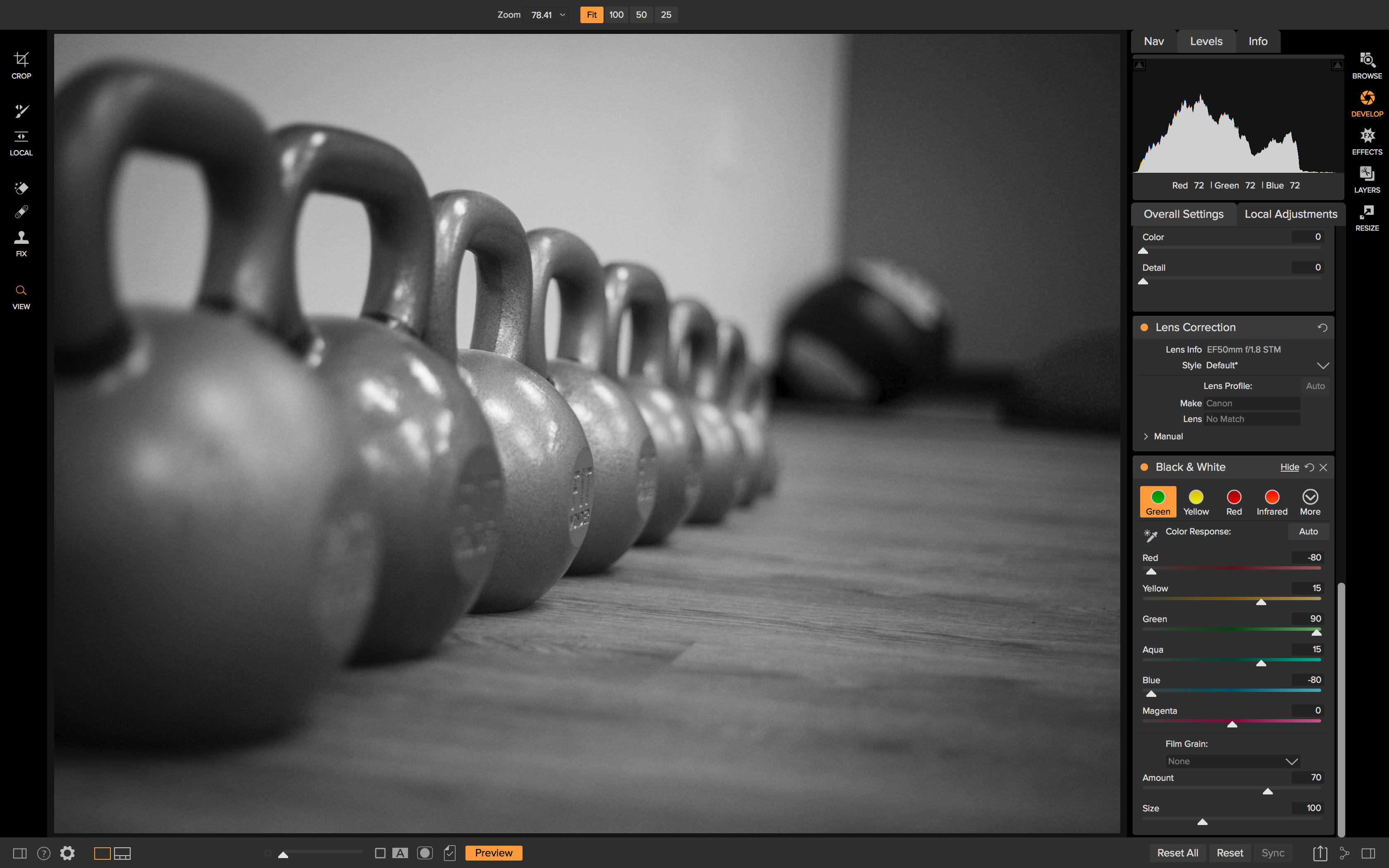
Photo-Editing Mistake #3: Overdoing the Details
The third bad photo editing mistake I see a lot in post-processing is the overuse of the structure slider and Dynamic Contrast. Don’t get me wrong, I love adding some micro-contrast to make my photo pop, but overusing them can cause subject haloing and distracting detail and make your photo seem unnatural. I know a lot of people that won’t even start with the tone of their photo, they will begin by adjusting the structure to add detail. This is completely fine, but if your photo lacks tone and composition, no detail can help your photo become more interesting. If you take one piece of advice for modifying detail in your photo, please let it be this: start small.
What I like to do when using the structure slider especially is to do the same as I did with saturation and drop it down to 0 and then bring it back to the amount I want. If you prefer a different way, at least take a moment to inspect your photo’s detail to see if it needs any amount of micro-contrast added onto it.
When adding Dynamic Contrast, I like to start with the Natural style first and then move onto Soft if Natural seems too heavy with detail. You could also reset all the sliders back to 0 and save that as a Reset style so you can start fresh with the sliders the next time you add Dynamic Contrast as a filter. Micro-contrast is a great tool to add detail to your photo, but a little goes a long way.
Too Much Structure Added:

The Right Amount of Structure Added:

Too Much Dynamic Contrast Added:

The Right Amount of Dynamic Contrast Added:
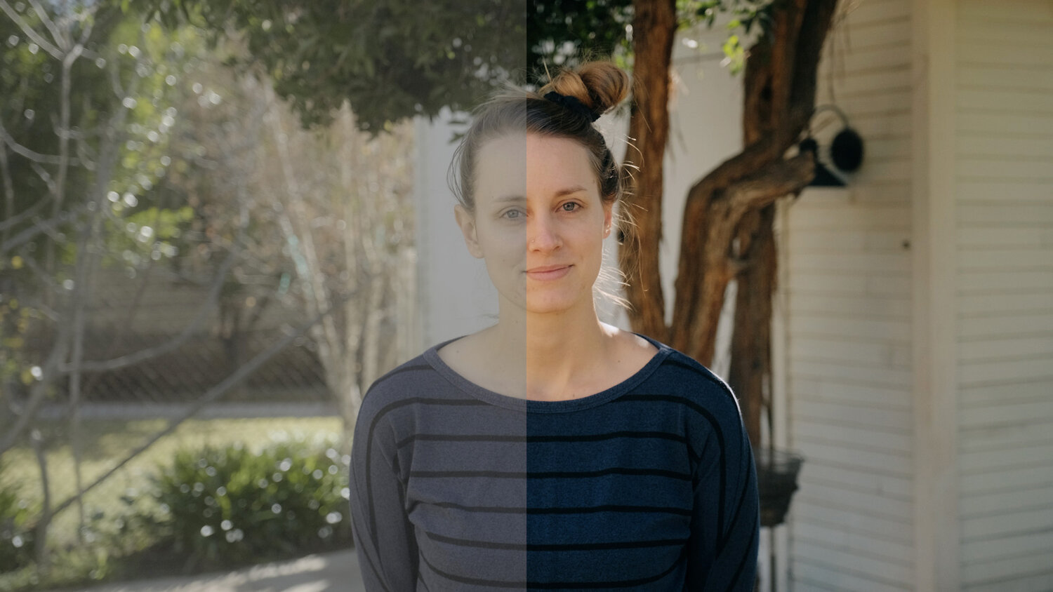
Photo-Editing Mistake #4: Overexposing or Underexposing
The fourth photo-editing mistake that is an editing no-no is to under or overexpose your photo in post-processing. The exposure slider might be the most basic adjustment control in the software world, and besides the saturation and structure slider, it may also be the most overused. The exposure slider is used to increase or decrease the exposure of your images, which in turn will brighten or darken your image.
It’s a great tool to use, and it does a great job bringing up the exposure of your photo, but when done incorrectly, you can have blown-out photos or dark subjects that your viewer can’t even see. Many times, people think to increase the exposure when dealing with shadowy areas in the foreground or background and end up with blown-out areas because the exposure will increase across the entire photo and not just the shadowy areas.
If you find yourself in this position, say you have a foreground subject that is dark and have some clouds in the background that are a little blown out, turning up the exposure to reveal the dark subject is just going to blow your clouds out more. The best thing to do when you have two different tonalities for your subject and background is to adjust your exposure to tone down the blown-out areas.
Then use the incredibly powerful shadow slider to bring back some shadow detail and reveal your dark subject. Vice versa if you have a blown-out subject. However, it’s tough to recover detail from a blown-out subject because that usually means your background is also blown out.
Bad Exposure Edit:

Good Exposure Edit:

Photo-Editing Mistake #5: Replacing Backgrounds
The last mistake in bad photo editing I see a lot of photo editing is landscape composites that don’t work. For example, a sky replacement was done so poorly that it seems out of place and unnatural. Replacing skies in photos can be a great way to add an impressive background if the sky is a little flat, dull, or blown out.
However, replacing the sky in photo editing is most often not necessary. If you do choose to take on this seemingly easy editing task, know this, realistic ones will take some time to do correctly. This also goes for any method that involves removing or replacing objects in your photos, such as removing the ex-boyfriend or ex-girlfriend from the family picnic photo. It will require some time.
Hope is not lost if you’ve committed these photo-editing mistakes. Consider the steps it will take to replace a sky in a photo. First, you must have a basic understanding of masking. From there, you must know how to blend the mask into the original photo so that your result photo looks realistic. It’s easy to spot terrible landscape composites, so if you want to be good at it, know how to use these tools to their fullest. Also, consider a much more natural-looking and less time-consuming route.
There are plenty of other ways you can enhance a dull sky in photo editing. For example, you could use the Textures filter in Effects to subtly blend in some cloud textures or import your own to make your sky pop without using separate layers. Try dodging and burning using the Local Adjustment brushes as well. You will add drama to an otherwise dull sky in just a few clicks.
Start in small steps if you go for the more editing-intensive new sky swap. Use a lower opacity on your masking brush to see how little or how much of the new sky you need to blend in. I recommend brushing in your replacement sky at lower opacities until you reach a natural look. Subtlety is key with most landscape composites if they are overdone, it will be very apparent.
Bad Composite:

Good Composite:

If you’re in the market for next-gen photo editing software, check out our ON1 Photo RAW editor. You can also try it out for free!