Description
Philm Color R3: The Evolution of Filmmaking LUTs
Philm Color R3 represents the culmination of extensive collaboration and feedback from filmmakers and studios across the industry. After thousands of uses in various productions, it’s clear that these LUTs have made a positive impact on countless projects. The support from the community has allowed me to further refine and expand the offerings, creating a diverse range of looks tailored to different storytelling needs.
The meticulous testing and fine-tuning by professionals have not only enriched the library of LUTs but also facilitated the inclusion of some unique styles in RED’s latest DSMC3 cameras. However, the full potential of what you can achieve with Philm Color R3 is significantly broader, presenting an extensive array of options for color grading to help bring your vision to life.
Whether you’re in pre-production or fine-tuning your project in post, the versatility of PCR3 allows for seamless integration across various platforms, ensuring that your imagery is polished and professional. From vibrant and cinematic to subdued and moody, Philm Color R3 is designed to cater to the artistic needs of modern filmmakers. So dive in and explore the feast of color possibilities!
PhilmColor R3 – col_labDevAndSat – 21 New LUTs
This is a collection of saturation models, density modifiers, and development LUTs.
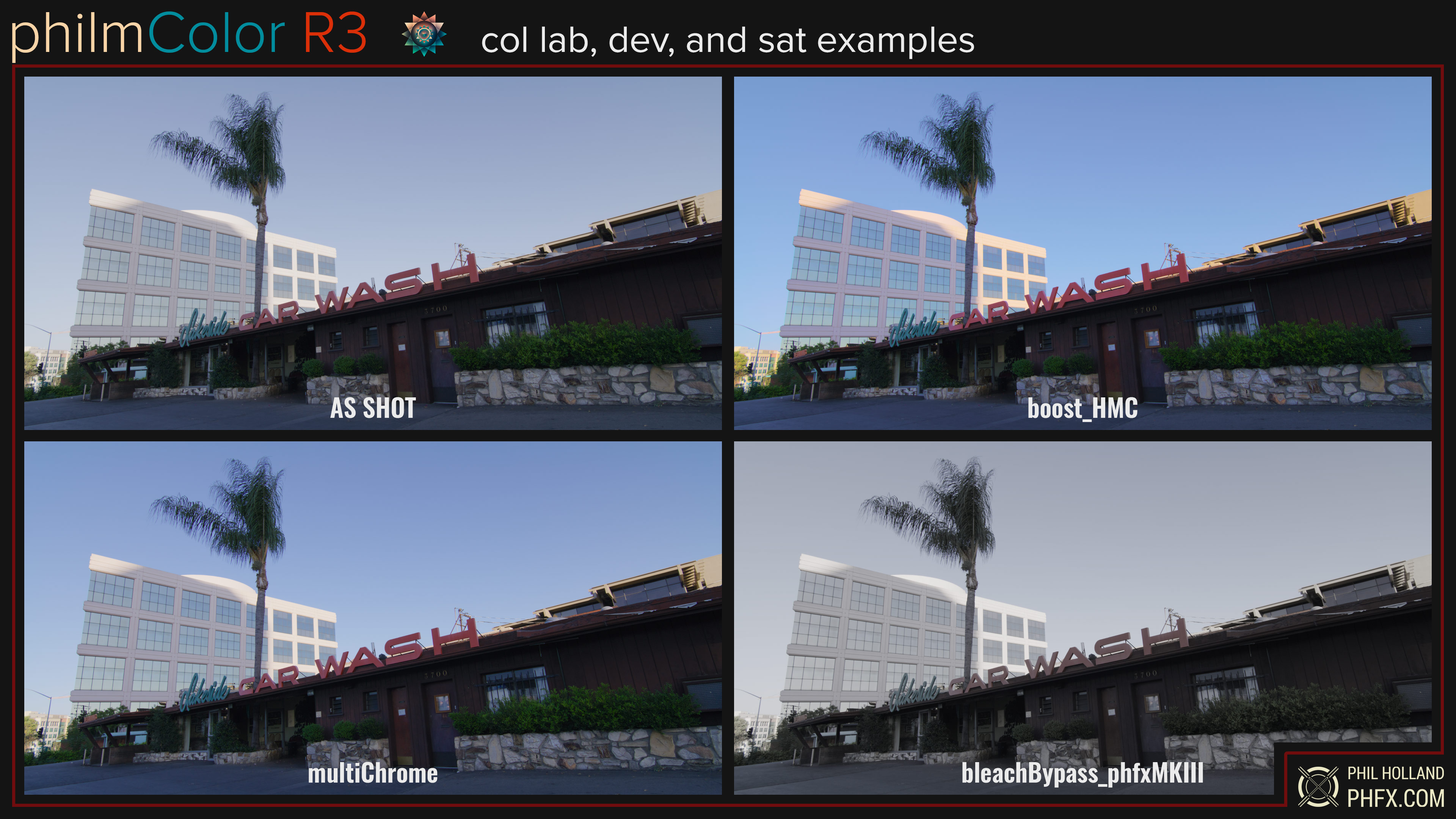
I’ve created two new Bleach Bypass models for PCR3 which when combined with some of the stronger curves create a very nice stylized look. For nature filmmakers who have dealt with a hazy day or sky that’s semi-not ideal, there are a few boosters for the highlights. I’m particularly fond of my “chromes” which feature unique color models leaning towards a dense and vibrant look as well as one print-inspired model. Subtractive color density as well as additive impact the weight of those hues towards a very film-like color response. A Sub CMY model will actually change how color is drawn a bit.
Two “natural” models that may provide a bit more of a perceptual tuned lower level of saturation and color density. A fun negative and negative tone only looks for those who understand the feeling of inversion 🙂 Two scrubbed looks appear to desaturate just the highlights as if they were scrapped from the print. And two subtractive tools to boost and reduce color accordingly. These are really designed for grading usages as dialing down their opacity or gain allows for personal tuning toward the look you’re after. Here are just a few examples.
crv_curves – 12 New LUTS
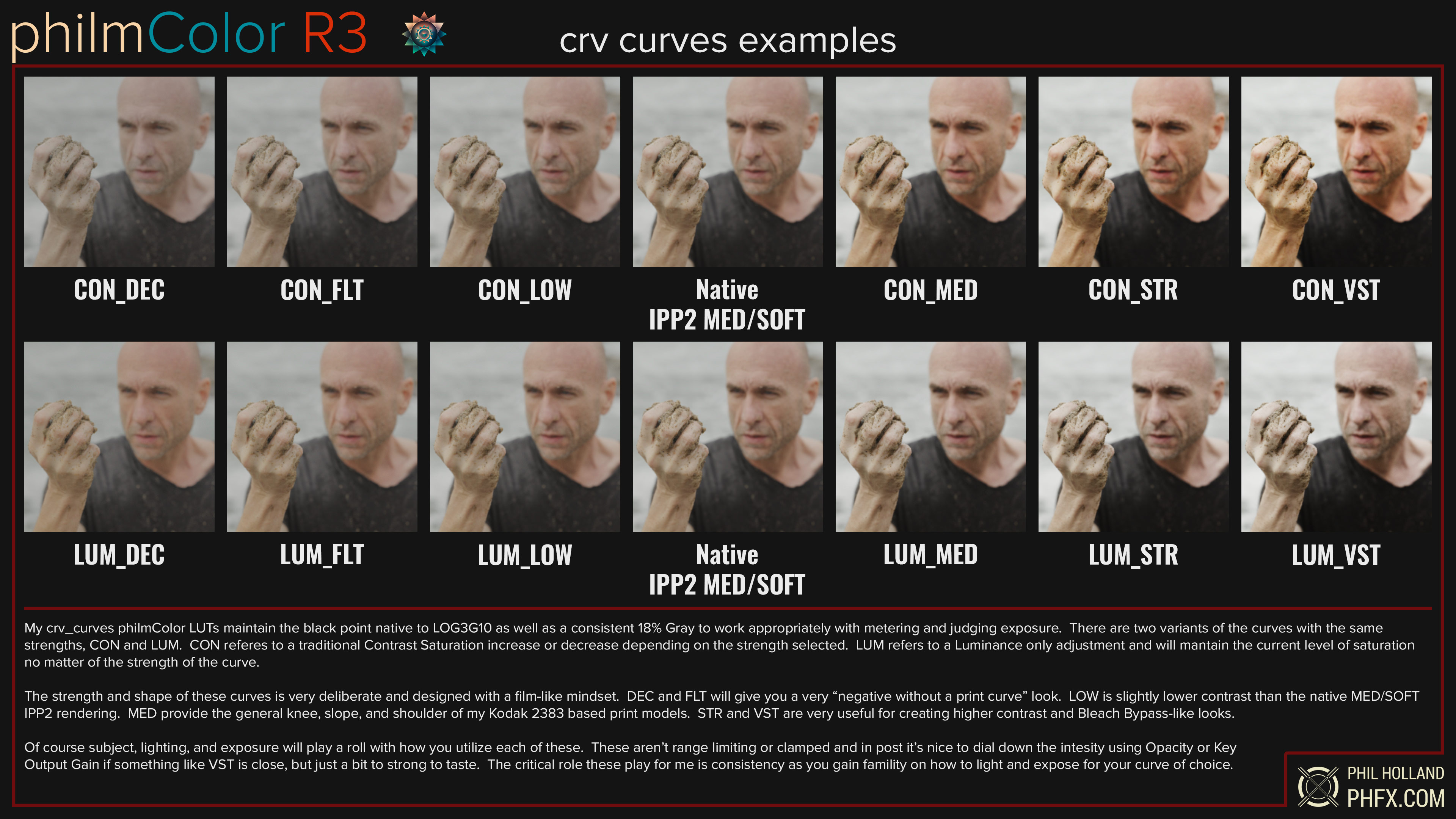
These are fantastic to use in camera and in post. PCR3 curves maintain the black point of log3G10 and keep 18% Gray precisely where it should stay. 6 strengths across two different techniques which can be seen here.
crv_fades – 8 New philmColor LUTS
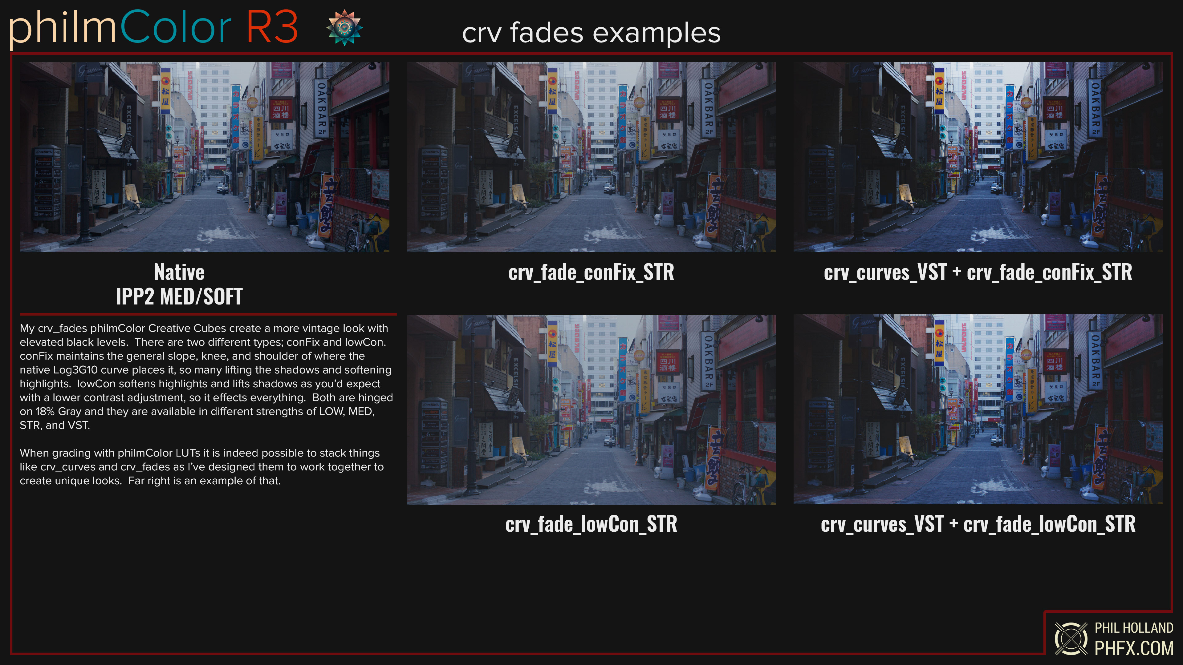
Faded looks are still rather popular, particularly when aiming at those elevated/lifted black levels. I’ve created two styles across 4 strengths each. This work nicely when combined with the curves ahead of them in the grading chain.
crv_tones – 36 New philmColor LUTS
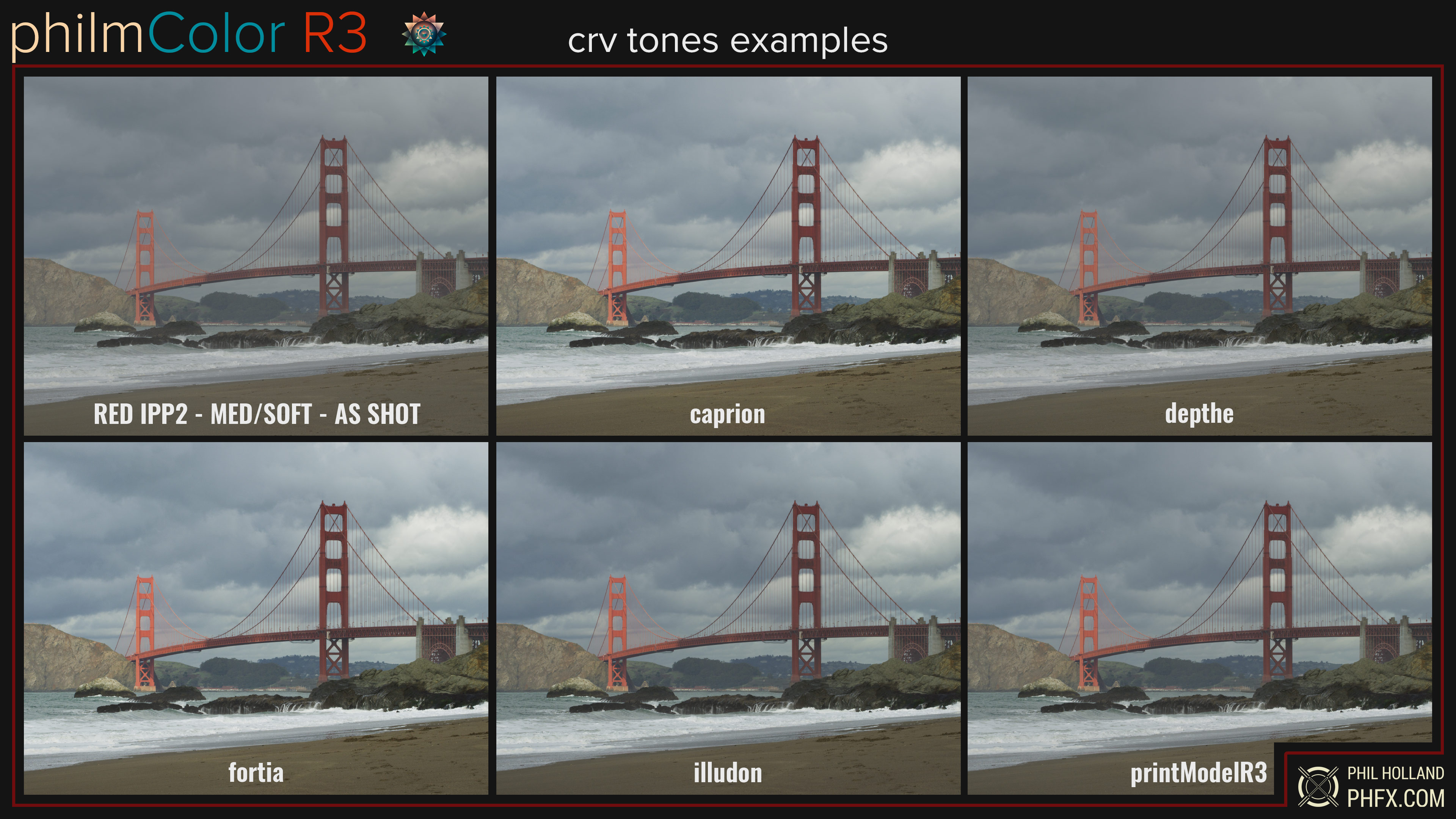
A collection of Creative Cube tones that don’t always keep 18% gray put for specific purposes like a pushing or pulling vibe. My FPE print model 3 with various black points exists here. There are also a few tones here designed for those who choose to expose to the right (ETTR).
grd_achromic – 10 New LUTS
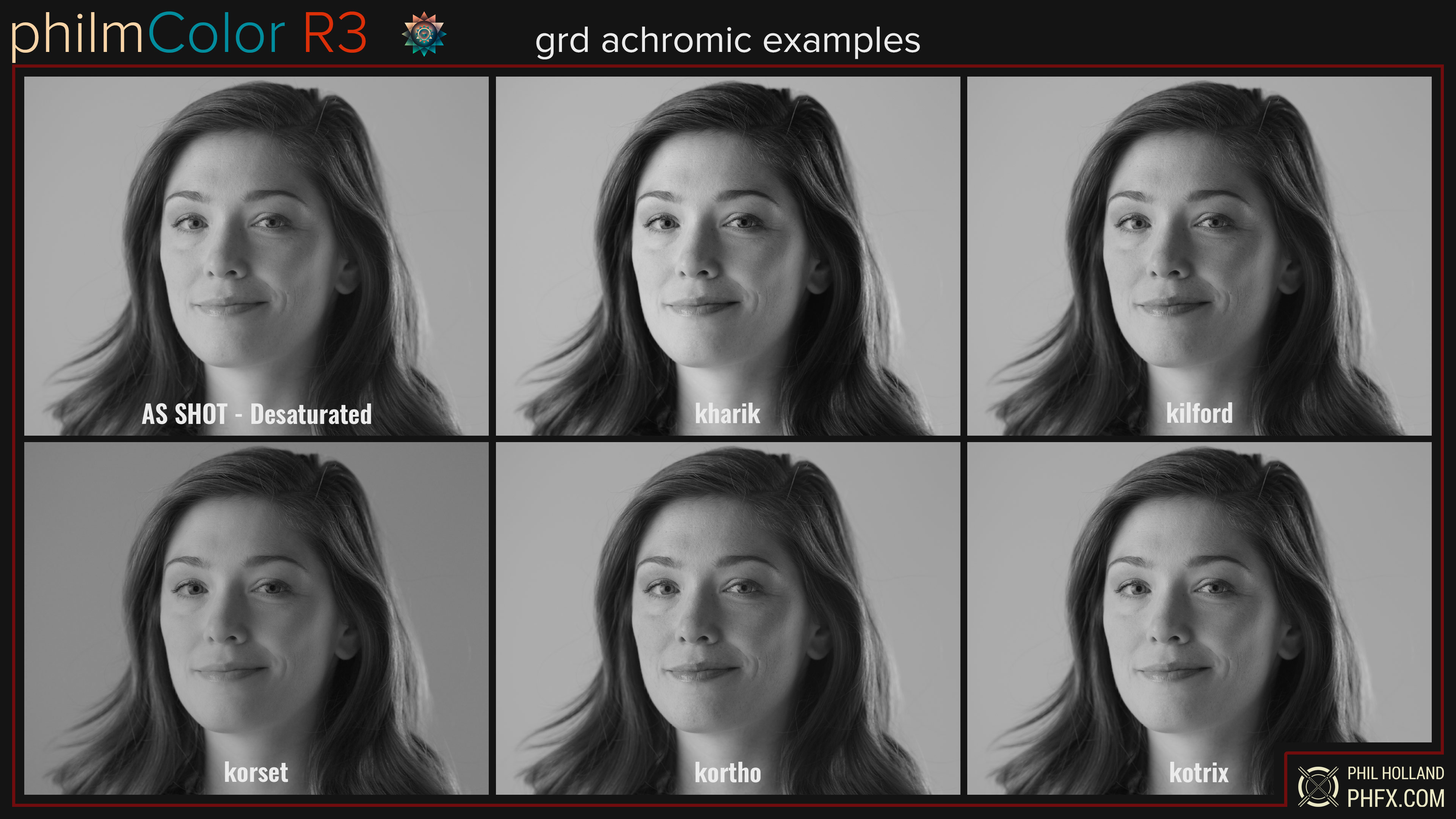
Achromic means colorless and it’s the term I’ve used for a long while now to describe the development process of a black-and-white image from full RGB color one.
I like this separation from the term monochromatic as RED creates dedicated monochrome cameras that have a specific black-and-white look. Achromic Creative Cubes utilize the color information from the RGB image and may or may not also contain a tone curve. The 10 new achromic stocks were based on user and production requests. Here are a few examples and remember, there’s a bunch more in philmColor R2 you also get.
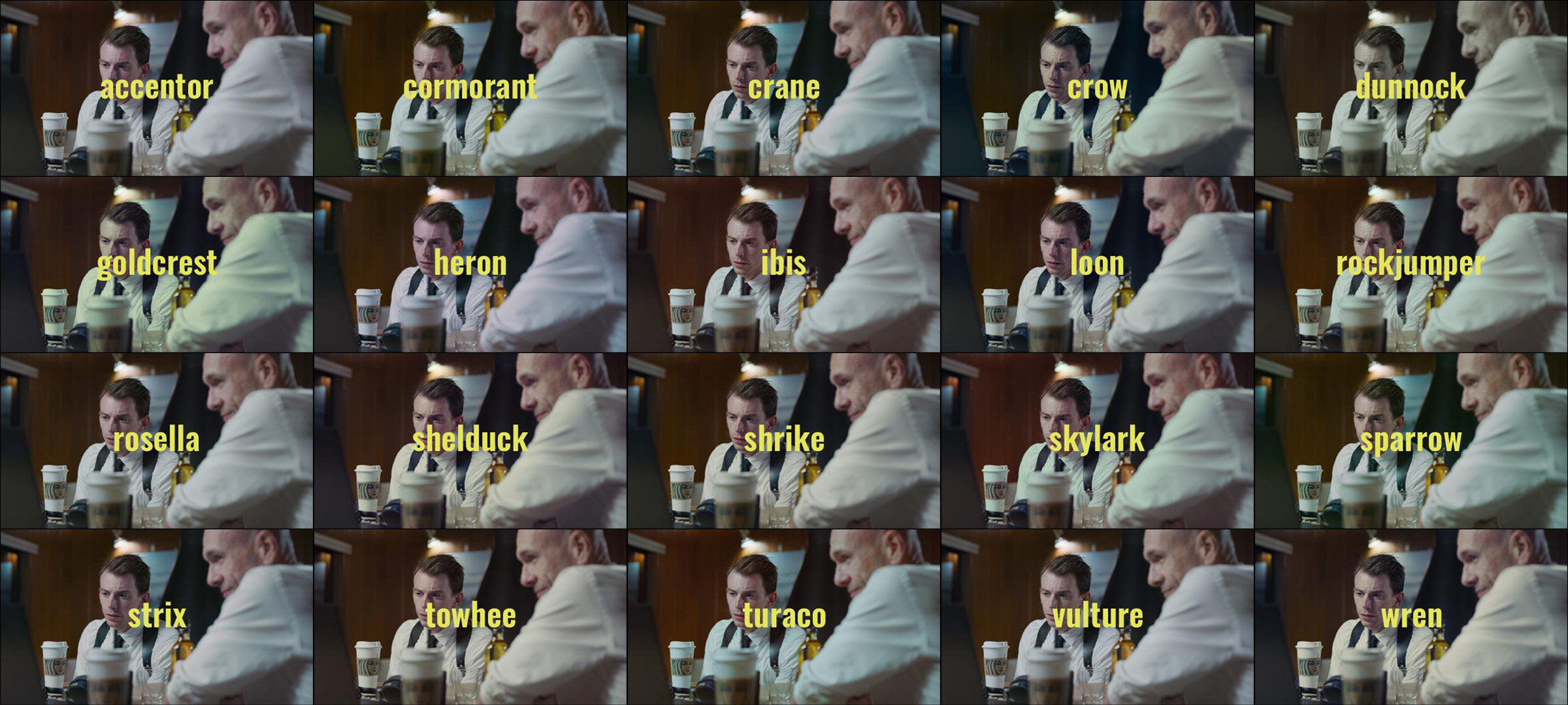
grd_polychromic – 70 New LUTs
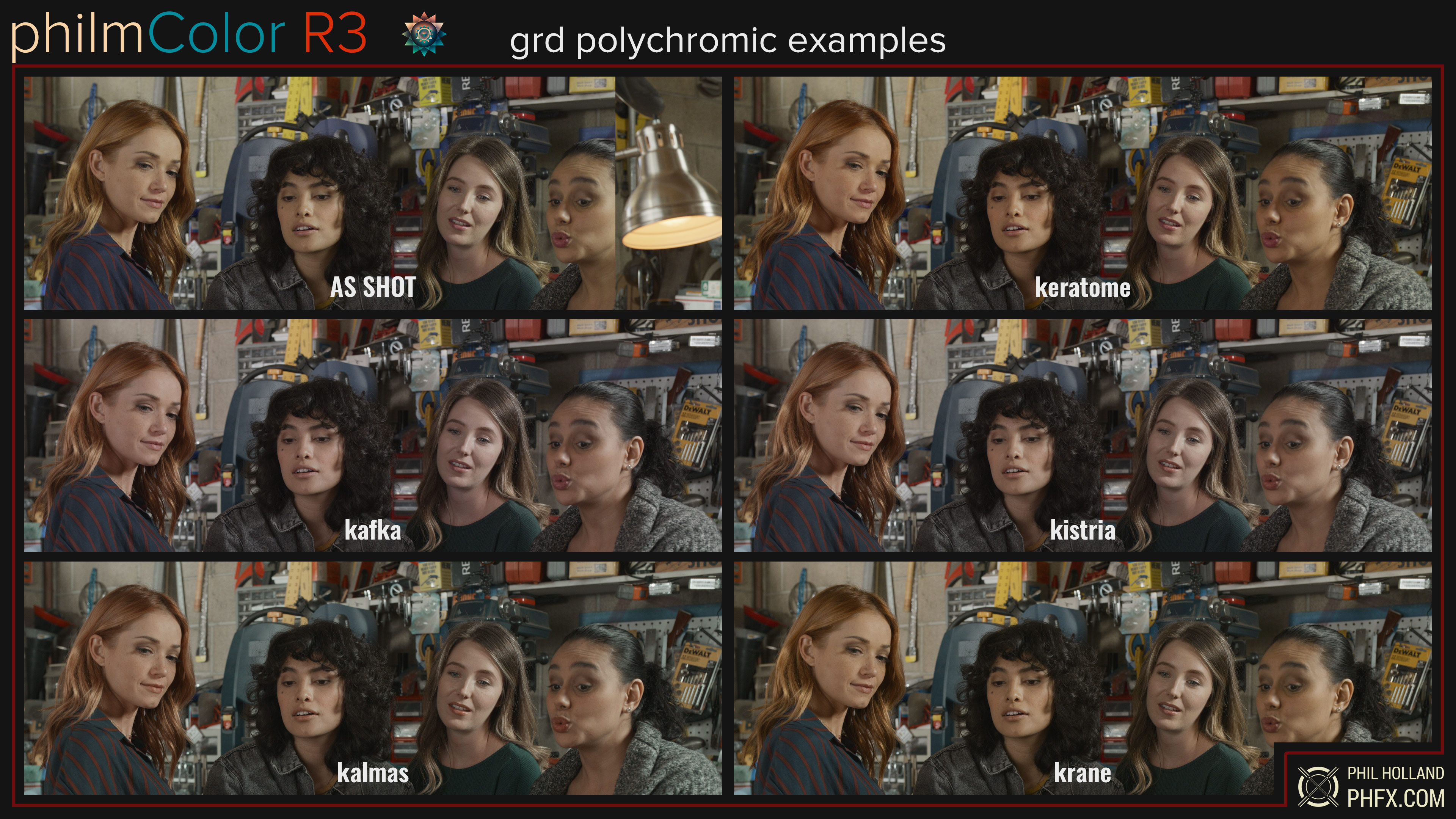
Many have requested a film-style matrix from me. While I have that and it’s here, I also have many derived from various tests and I find a simple matrix doesn’t always get the job done when aiming at things like my Kodak, Fujifilm, and other film stock Color Targets. The sheer concept of polychromic looks is to change the color without moving of the white point, so no split tone color gradients, and of course keeping the exposure exactly where it’s at. Depending on the LUT they may or may not have a linear color response.
I describe these as “digital negative stocks”. This is how I visualize things as these adhere to the guidelines of how I often have defined that concept for a couple of decades now. I love the simplicity of these when used on their own, but they have also been designed to use in combination with Print Split Tones after the Polychromic LUT in the grade to create a very wide variety of looks that are rather familiar film-like appeal.
The development of these polychromic LUTs leans in a very Kodak-minded direction most of the time and contains familiar primaries, secondaries, and tertiary colors as well as color density inspired by photographic response to light. Often but not always; deeper reds, yellows that lean to peachier hues, greens that lean towards warm or cool depending on where the look is leaning, blues that range from real blue to a more cyan bias, and of course a frequent squashing of magenta leaning more violet or red. Something interesting to observe during my film tests has been the subtle movement into complementary color schemes that come up time and time again.
All of these keep a complimentary mindset in mind, though some lean more toward triadic themes as well. There are 2.5 strips, 3 strips, as well as triadic builds here. But as always they are hinged around creating pleasing skin tones first and foremost. In this case, I’m often building the themes from very specific hues. Think of this more like a palette-limiting or expanding concept. Subtle in nature, but can have a large impact if you have a lot of color in the frame.
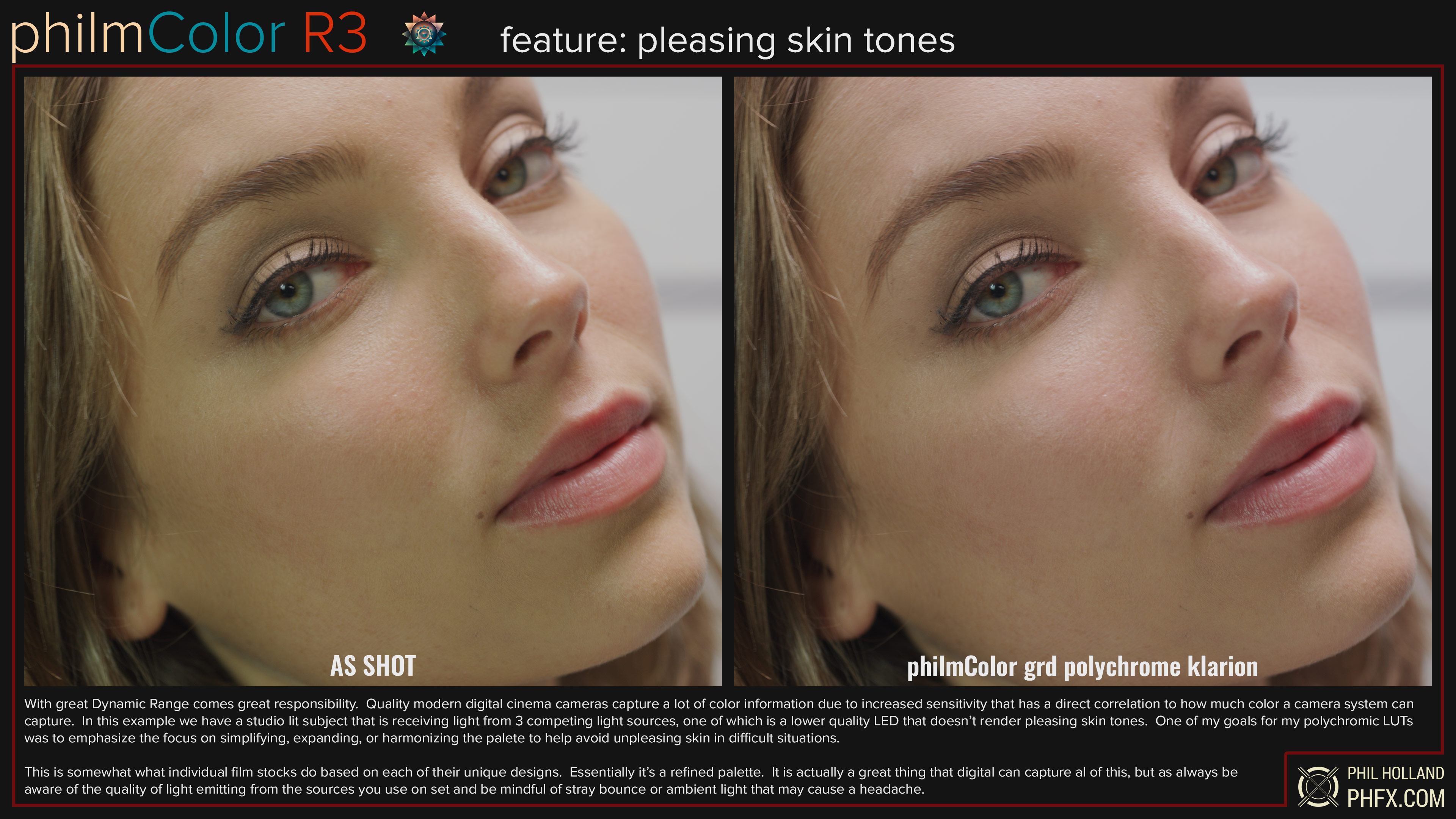
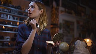
Here’s an example of the guided palette of a polychromic stock solving a particularly difficult mixed lighting condition. Without a color meter, this was likely overlooked as it’s pretty subtle to the eye. All of my polychromic stocks are designed to keep skin tones in a pleasing range fitting their unique color theme.
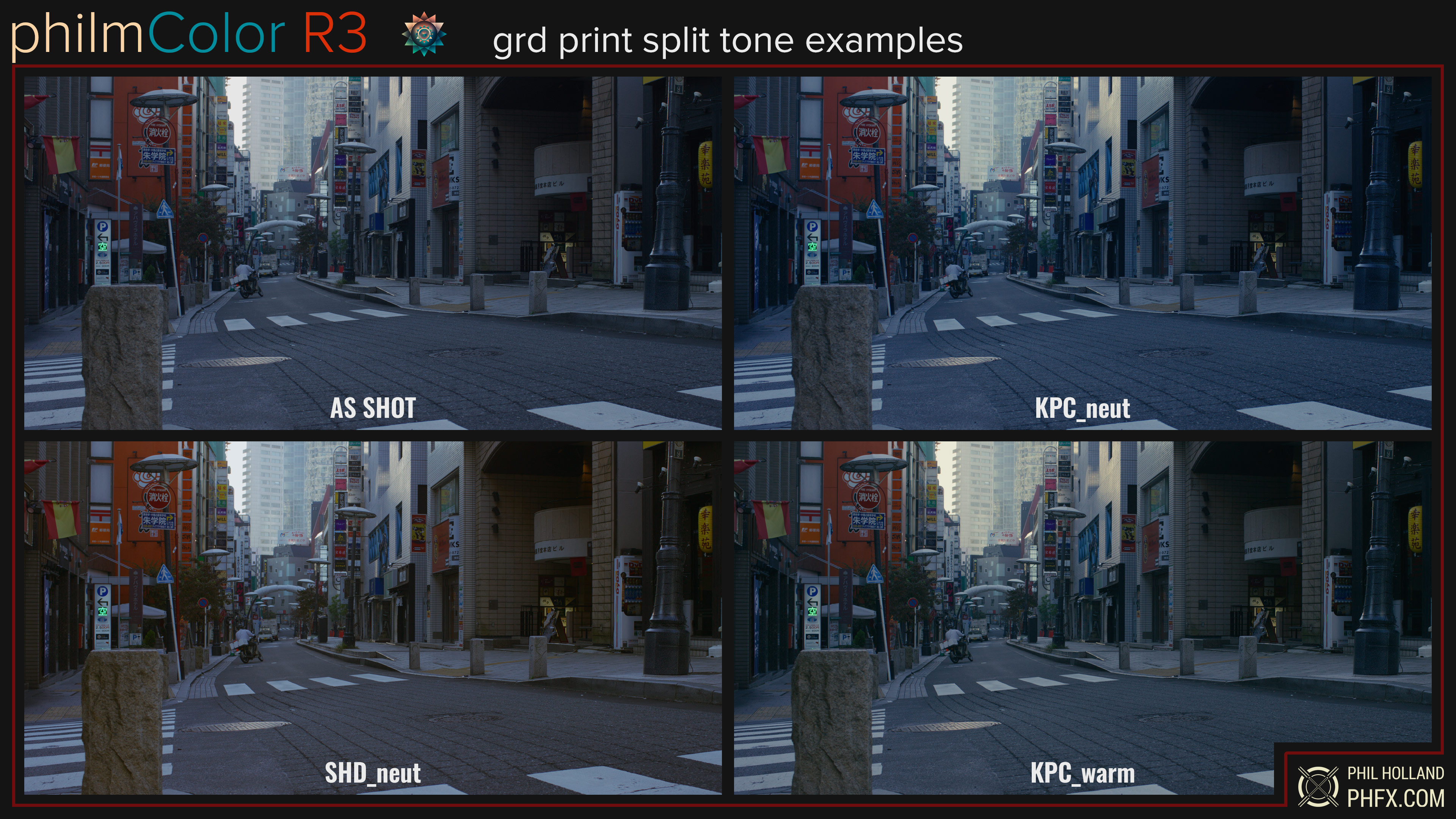
grd_printSplitTone – 27 New philmColor LUTS
philmColor R3’s Print Split Tones are based on common and popular split tones used in both modern and vintage eras. These work great on their own, but they work even better when combining them with a polychromic Creative Cube ahead of even after them in the grade to create unique looks. There are 9 Print Split Tones with Neutral, Warm, and Cool versions. Warm and Cool represent D55 and D65 White Points. As with some processes some of these work rather well in unique natural lighting conditions when warm or cool shadows exist providing non-linear corrective or stylized directions to the image.
grd_revisedBaseStocks – 20 New philmColor LUTS
Due to feedback from filmmakers I was able to figure out pretty quickly which looks from the previous philmColor releases were the most popular, not to mention seeing the looks pop up on my TV occasionally. Some of these were based on scan data or my own choice that included subtle tone curves, however, for philmColor R3 I have removed these curves which makes them a bit more flexible as well as maintaining a truer look to your lighting contrast on set. These are fully developed looks, may change the white point, and might have a nonlinear color response. and may or may not contain a split tone. Here’s the list of Revised Base Stocks.
grd_schema – 204 New philmColor LUTS
This is the bulk of the bolder, fully fleshed-out creative looks for Release 3. Film looks, show luts, commercial looks, and all sorts of other stylized schemes can be found within. Some of these have actually been designed for productions as well. There are a few in here I’m very fond of and you may have already seen content mastered with them. Some are very useful general shooting stocks as well when crafting modern looks, similar to R2’s base stocks. Spend some time previewing these to get familiar with them. There’s a lot to explore here.
out_ARC – 4 New Output Transforms
Tended to with a great deal of care, I have crafted 4 unique and new RED IPP2 Output Transforms, which have been much requested. There are both SDR and HDR variants with several different black points. All of my Output Transforms are available in 33x33x33 and 65x65x65 cubes.
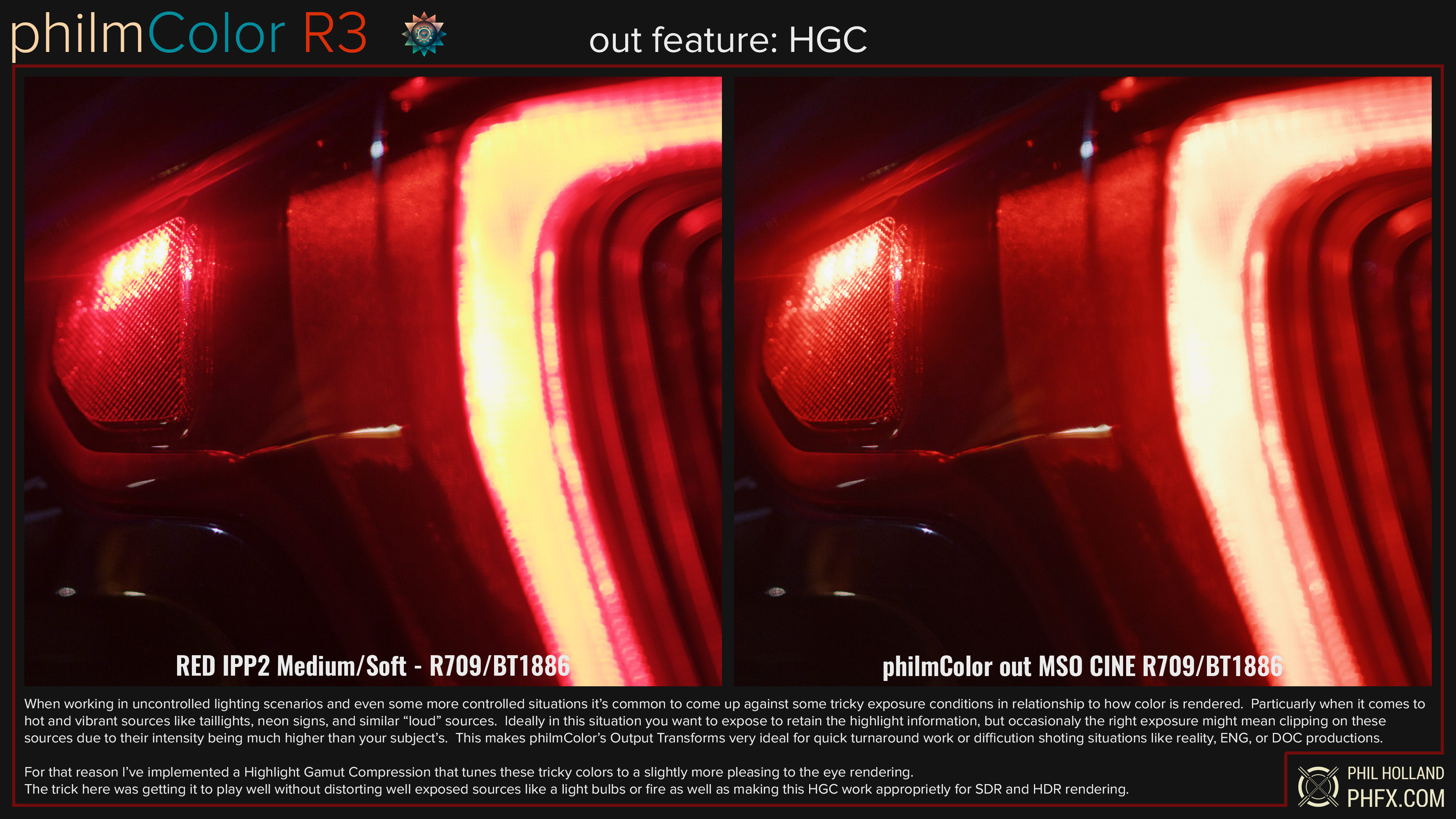
One more note. All of philmColor’s Output Transforms feature Highlight Gamut Compression to tackle those tricky colors you occasionally come by when you can’t control the source or the exposure related to your subject. I’ve spent time to make this compression pleasing to the eye while not having an impact on well-exposed hot and colorful sources. Here’s an example of it in action:
out_PFE_CLR – 2 New Output Transforms
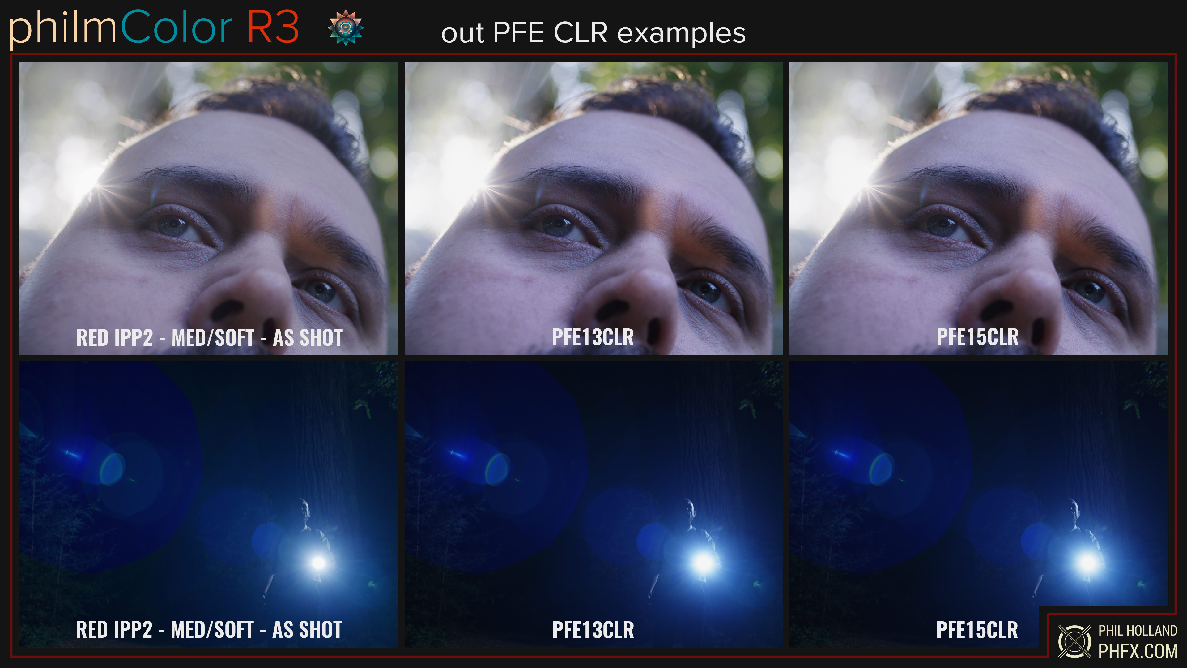
This is my Film Print Output Transform except it is “clear” with now print split tone. The idea is you may want to add your own after the Output Transform if you so desire. I have included both 13 and 15-stop variants with two black points. Ideally, you have a camera that captures beyond this with whatever your ISO Rating is. On most decent digital cinema cameras ISO 800 and higher should suffice. These do feature a hard clip below 100% IRE to create that rather specific soft highlight look.
out_RED – RED’s default Medium/Soft Output Transform
No preview is needed here. I’m including RED’s official Medium Contrast Output Tone Map with the Soft Highlight Roll-Off in SDR and HDR variants. This is the default in RED’s modern cameras and what I recommend as a starting point overall. My Creative Cube Curves have been really optimized for this general curve strength, 18% Gray, black point, etc. My own Output Transforms of ARC, MSO, and PGV share similar qualities as well, but of course, are slightly different.
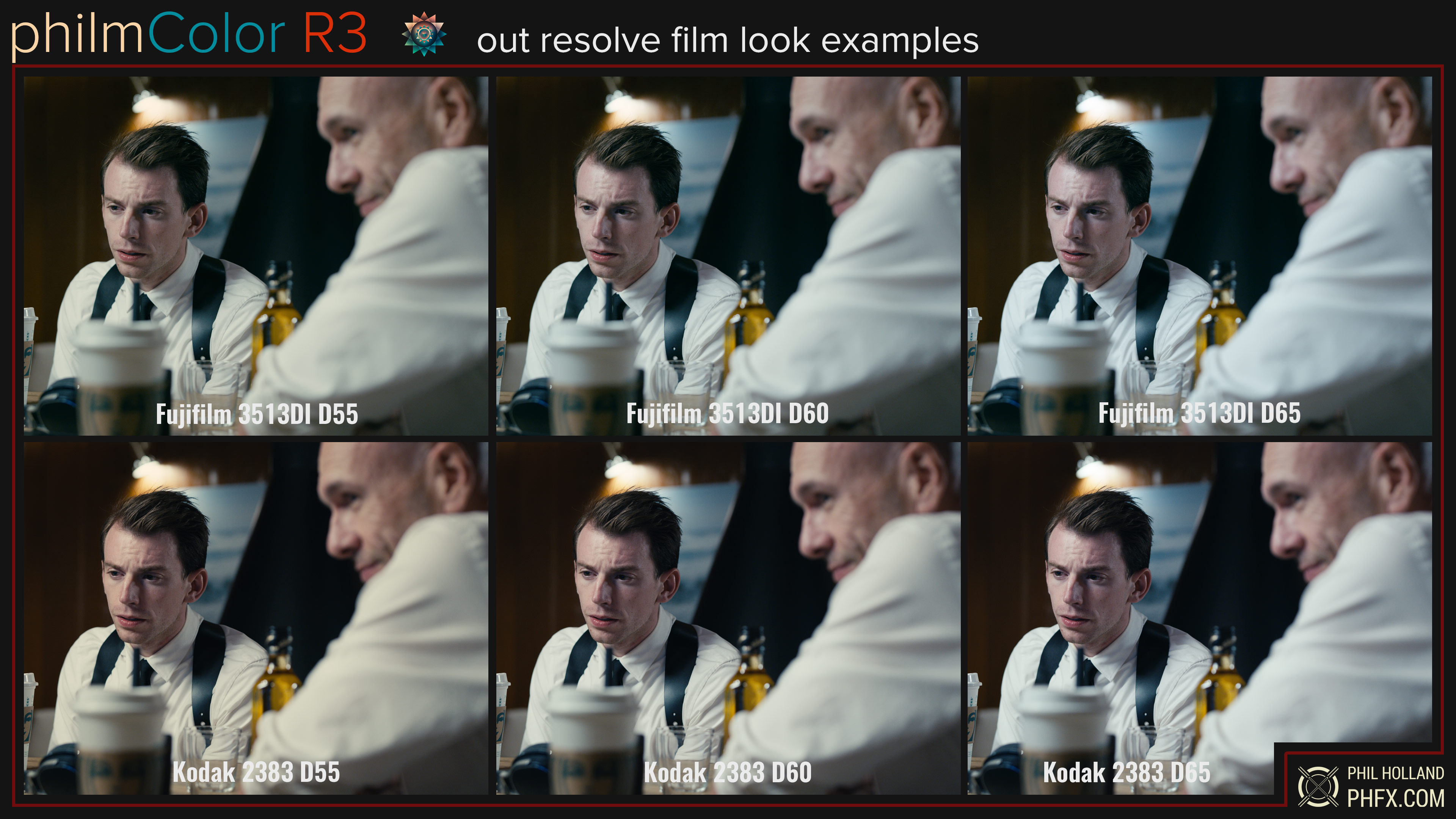
out_resolveFilmLooks – 12 New philmColor LUTS
The popularity of the included Film Looks in DaVinci Resolve Studio is undeniable as you can spot them everywhere. However, I’ve seen a lot of strange or incorrect ways of using these online and even at post houses. I reached out to my friends over a Blackmagic Design and inquired about releasing authorized versions of these Kodak and Fujifilm print LUTs optimized for RED’s IPP2 workflow for use as an Output Transform. They thankfully agreed, down under high fives! As such these have the appropriate 18% Gray point to match all of the Creative Cube curves and Output Transforms. These actually want a bit more saturation than my color workup, but I’ve noticed a trend of people keeping it about these levels I’ve created here. They share some of the DNA of my other output transforms as well as the high gamut compression.
Because these are now full IPP2 Output Transforms, what’s also fun to explore is using my labDevSat or polychromic Creative Cube ahead of these for a wide variety of looks that get you to a very film-like place. Think “film negative” plus “film print” if you catch my drift.
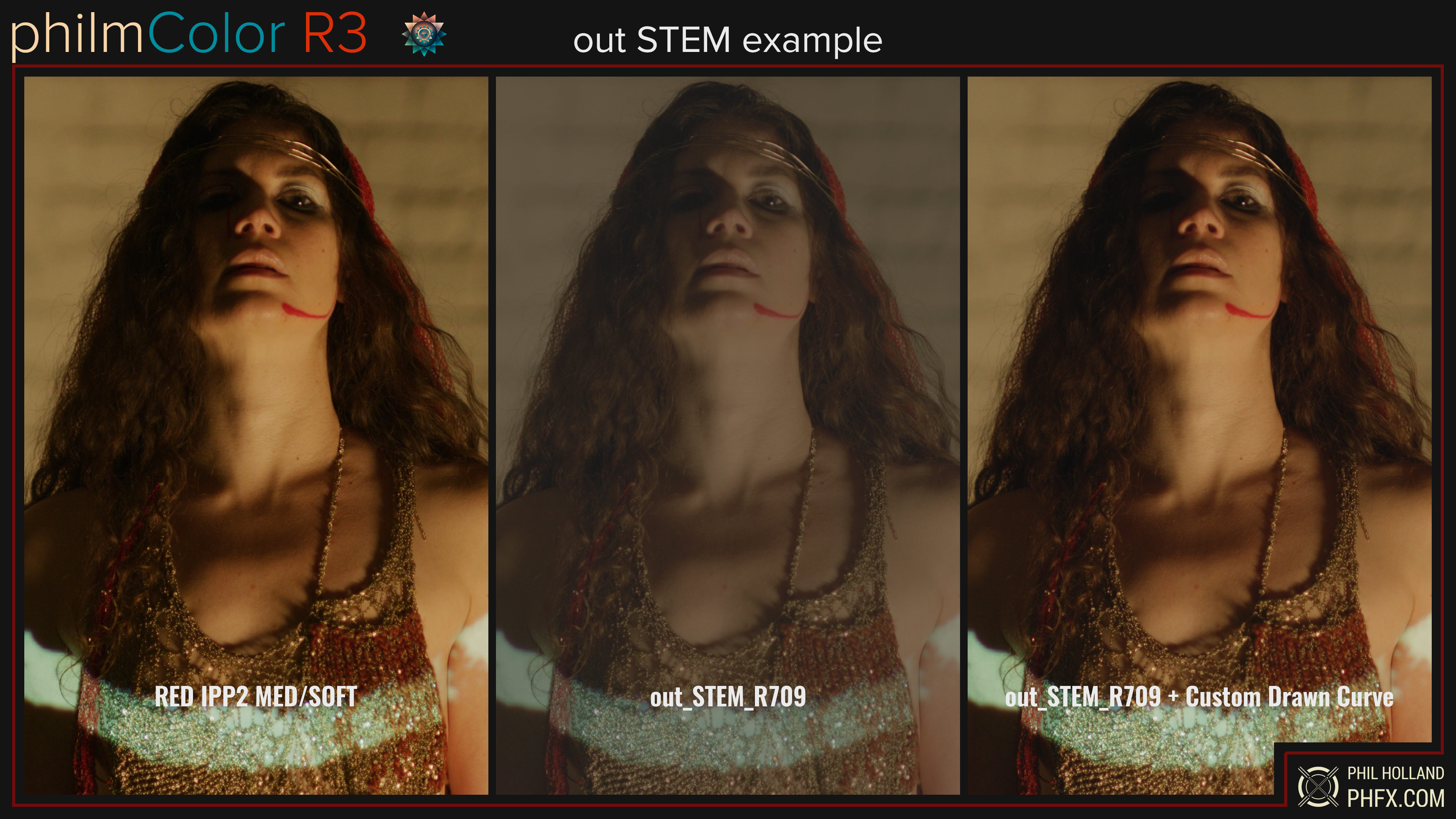
out_STEM – 3 New philmColor LUTS
For Advanced Users and Colorists who wish to create their own Output Tone Curves I’ve created these output grading STEMs for REC709, REC2020, and P3D65. These include my color workup with high gamut compression, but these have no curve attached and you will need to draw one after the color space conversion.
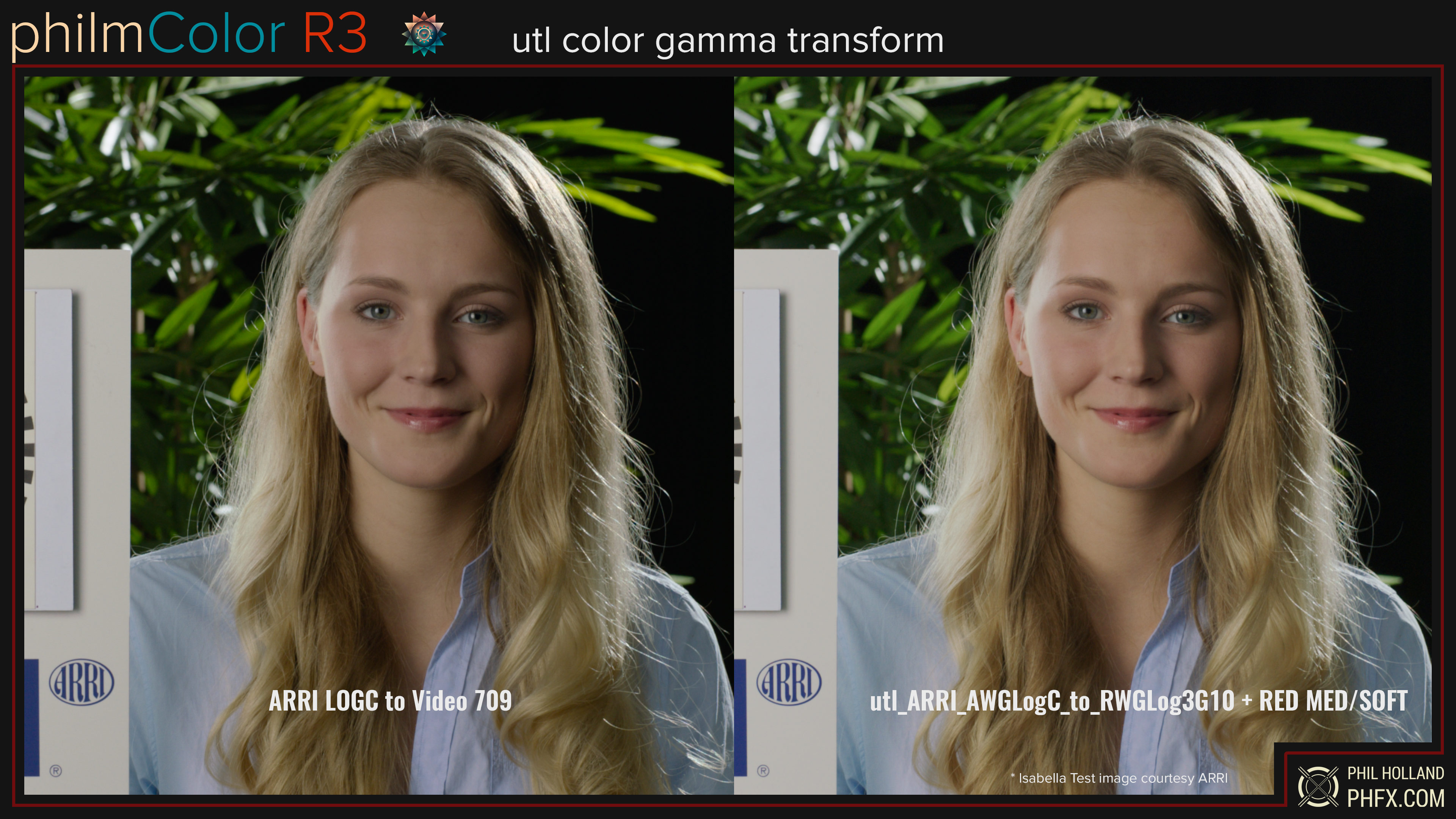
utl_colorGammaTransforms – 10 Utility LUTs
As many have figured out with philmColor’s previous release you can indeed use my LUTs with many other cameras. The ideal way is to transform whatever the camera’s captured Color Space and Gamma into REDWideGamutRGB and Log3G10. It’s also very, very common to have more than one type of camera on set these days. I am including a few very common digital cinema cameras, mirrorless cameras, and generic transforms with PCR3’s release, but I’ll also be updating and adding to these as camera manufacturers come up with new wild and wacky ways to capture footage. Included with this release are:
– ARRI – AWG3/LogC3
– ARRI – AWG4/LogC4
– BMD – BMDWG5/FG5
– Canon – CCG/C-Log2
– Canon – CCG/C-Log3
– DJI – DGam/DLog
– Fujifilm – FGam/FLog
– Generic REC709 – REC709/BT1886
– GoPro – REC709/FLAT
– Nikon – NGam/NLog
– Panasonic – VGam/Vlog
– Sony – S-Gamut3/S-Log3
Also, to make life easier, I’ve created a few ARRI-specific CGTs to go from their old color science to Reveal Color Science and vice versa.
If there’s a Color Space or Gamma you don’t see on this list that you want to be supported, let me know. But as I mentioned I’ll also be updating these over time. So expect a PCR3.1 or whatever update as I know of two new spaces on the horizon that haven’t even landed yet.
And a quick example of this in action:
With philmColor R3 you also get the entirety of Release 2, which of course also includes Release 1. I have updated the metadata of these LUTs to include the modern metadata that RED’s Creative Cubes utilize, so I do recommend installing these if you use philmColor R2 in your workflow. The LUTs themselves are identical otherwise.
In terms of combined workflow with R3. Much like my polychromic and schema LUTs, ghostStock and Basestocks are meant to be used on top of the crv LUTs. Achromic can be used on their own if desired. The rest is up to you to discover how they best fit your creative desires.
ghostStocks – There are 30 ghostStocks. Their purpose is to serve more like color science and are designed to slightly tune chroma and luma responses. These are far more subtle than most of the base stocks. Overall my goal with these is to provide different approaches to skin tones and more subtle hues found in situations such as dusk. Many of these are reverse-engineered from the motion picture and still film to provide a similar color response to your RED footage. These all meter accurately to 18% Gray in the camera.
printModels – There are 4 main printModels with this release and their variations which adds up to 20 total cubes. Each is loosely based on a film-like print response. They come in a variety of strengths. Pure, Flat, Flatter, Punchy, and Thin.
toneAdjusts – There are 29 of these and mostly these are intended as tonal helpers, though you may find a couple of them pleasing on camera (like the cineTone variants). Some are purely utilities. For instance, if you desire to pull down your highlights only, there’s a LUT for that. Additionally, these come in different strengths. Full, Half, and Quarter. New for Release 2 is some additional “metal” stocks in this category that feature carefully crafted tone maps.
achromicStocks – New for Release 2 are the 24 achromicStocks. Achromic means “colorless” and that’s exactly what these do, remove color. The focus here is to create black-and-white cinematography created from your in-color RED footage. These tap into color channel information as well as luminance tone adjustments to create unique looks of black and white.
When you purchase philmColor make sure to extract the philmColorR3 and philmColorR2 to the LUT directory of your Grading Suite, NLE, or whatever program you are using to work with these LUTs. The advantage of LUT-based workflows is they work anywhere where 3D LUTs are supported. This included any software package that supports 3D LUTs, monitors, and in this case within RED Cameras themselves. This is useful when sending LUTs off to editors, colorists, etc.
RED IPP2 Color Workflow – Color Grading Workflow: Order of Operations
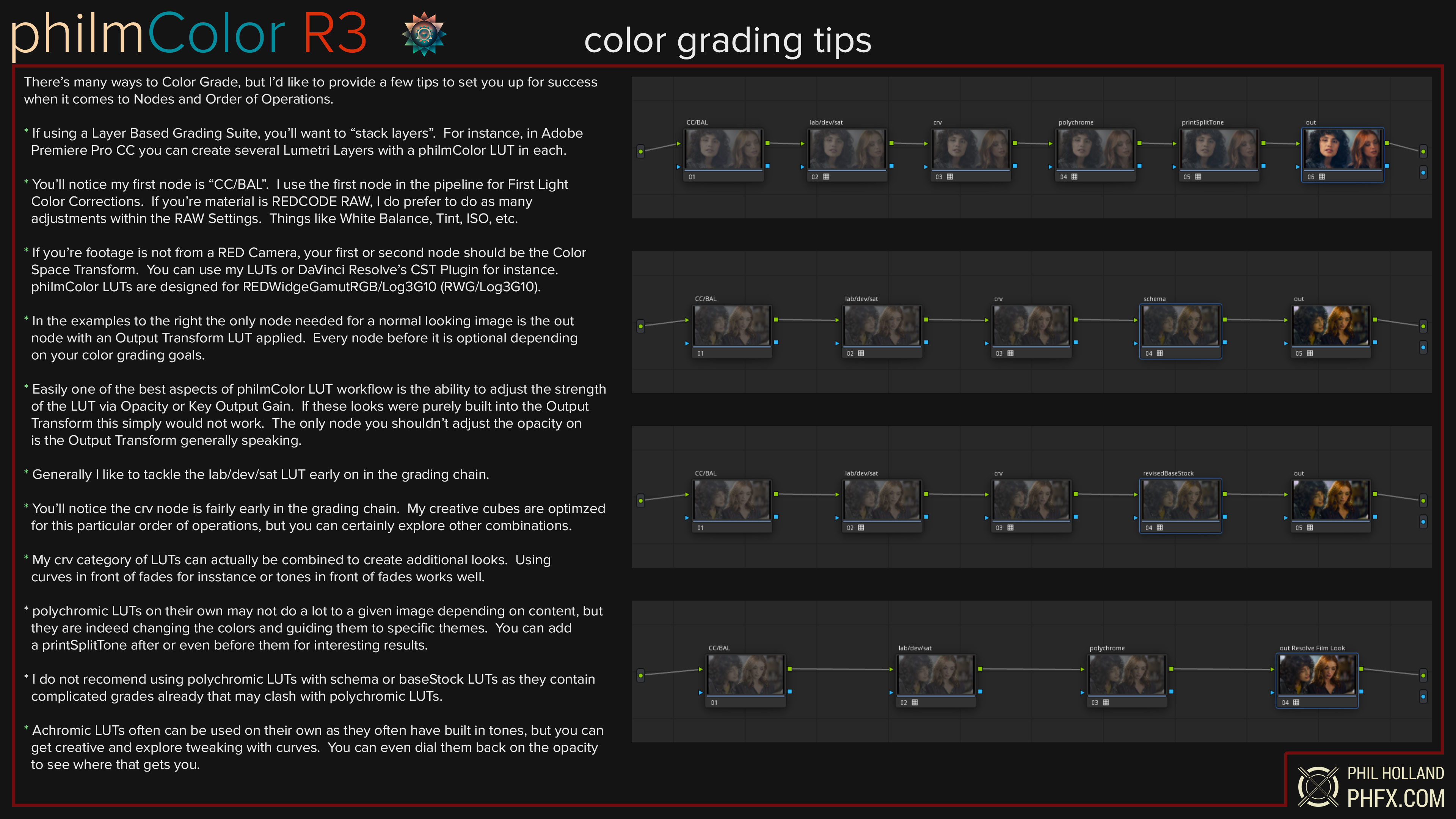
REDWideGamutRGB/Log3G10 > Grading (philmColor Creative Cubes Go Here) > Output Transform (RED’s or philmColor Output Transforms go here)
* I personally enjoy thinking of this workflow as film > lab > print as there’s synergy with that mindset.
* RED’s IPP2 Color Workflow is built around the concept of a Scene Referred Workflow to export out to a desired Display Output in SDR or HDR.
* Footage should be captured in REDCODE RAW set to RWG/Log3G10 or using a Mezzanine Codec (like ProRes) captured or converted via Color Space Transform to RWG/Log3G10.
* Footage from other cameras can be used with philmColor via a Color Space Tranform. I include several in my utl_colorSpactTransforms.
* General tip for all color grading. Ensure your Color Grading Software or NLE supports Tetrahedral or Tricubic LUT Interpolation for best results.
philmColor Color Grading Workflow
philmColor is comprised of Creative Cubes which go in the Grading section of the IPP2 Color Workflow as well as my own Output Transforms which go at the end of the pipeline.
* philmColor Creative Cubes can be used on their own or used together to create even more personalized unique looks.
* I strongly recommend using RED’s IPP2 Output Transform of Medium Output Tone Map with the Soft Highlight Roll-Off as a good starting space.
* Most of philmColor Creative Cube Curves and Output Transforms are based around 18% Gray of RED’s Medium/Soft which produces consistent results when metering and exposing.
* philmColor Output Transforms ARC, MSO, and PGV share the same knee and 18% Gray of RED’s Medium/Soft. I recommend starting here if not using RED’s Output Transforms.
* philmColor Output Transforms BOW, PFE, and Resolve Film Looks are about the same contrast strength as “crv_curves” MED applied, which is closer to my Kodak Print Curve.
philmColor – In-Camera Workflow
philmColor LUTs are compatible with all RED DSCM3 Cameras as well as DSMC2 cameras that support 33x33x33 sized 3D LUTs.
Copying philmColor LUTs to Media Cards
To install create a “luts” directory at the root directory on your media card. Copy your desired LUTs within that folder.
To Import on DSMC3
MENU>IMAGE/LUT>3D LUT>On Media LUTs
To Import on DSMC2
Menu > Image > 3DLUT > Import/Export
Ensure the LUT is “enabled” to see its impact on the footage and to include it in the monitoring path. When enabled the philmColor LUT will be included with the R3D or ProRes in the.RDC folder which carries on through post and is supported in the SDK. Very useful to forward looks on to Colorists, Editors, VFX Supervisors, etc.
* A quick note. You will see both in my Creative Cubes and Output Transforms keycodes for BLCK, CINE, FILM, and LIFT. These refer to the black point of the curve.
* If using a Creative Cube that features this keycode, I recommend using an output Transform with CINE or RED’s IPP2 Medium/Soft Output Transform.
* The Output Transforms that feature this keycode is designed to produce that black point from the get-go, which some may prefer.
* Overall for most people, particularly for web delivery CINE is likely the way to go unless there’s a specific aesthetic you are after.
* BLCK refers to a 0 black point, which means if you have been exposed to no light it will produce a zero IRE value.
* CINE is the black point that RED and ARRI now utilize.
* FILM is the black point I use to imply the black levels of a projected film print on modern emissive displays.
* LIFT is an elevated black point for that “milky shadow” aesthetic.
If you are a previous owner of Release 2, you do indeed get a free upgrade to Release 3. It’s a really easy process.
* Click Purchase and Login to your Gumroad account with the email you signed up/purchased with
* Go to your previous purchases
* You’ll magically see philmColor R3 there as it replaces R2
* Download and install in your software’s LUT directory
It would be impossible to thank everybody at this point. But the tremendous support of RED, Jarred Land, Jim Jannard, and Graeme Nattress can’t be understated. The studios and manufacturers who have helped along the way should also be commended as well as the many filmmakers who have contributed to my LUT Development Test Bed. Special thanks to Blackmagic Design for allowing me to modernize their Film Looks for IPP2. Big, big thanks to Adobe for finally updating CC with Tetrahedral LUT Interpolation.
After a bit of gripping and gaffing for petty cash, Phil Holland began his career in the motion picture industry on the VFX side of things in 1999 working in the Scanning and Recording Department at Rhythm and Hues Studios. As a Digital Imaging Specialist, he had the privilege to explore film rather deeply through cinematography, high-resolution scanning, high-resolution laser recording, and his efforts as a Digital Colorist on feature films. From 2011 on Phil moved on to pursue his Directing and Cinematography career with a keen interest in bleeding-edge digital cinema technology.
As of late, he’s been spending a great deal of time up in the air filming aerials all over the globe as well as executing some smaller-scale narrative and commercial pieces. Cinematic and Commercial Color developments have still played a major part in his professional career during these years. Outside of more creative color work, Phil has been an early adopter and innovator in HDR Color grading and delivery, has created color profiles for computers, tablets, and smartphones, as well as consulting on many color pipelines. You can learn more about Phil and his work at www.phfx.com
philmColor is copyright Phil Holland © 2016-2022.
FOCUS KEYWORDS: cinematic luts, # Cinematic Tones LUTs, # Cinematic Video Effects, # Color Correction LUTs, # Color Enhancement LUTs, # Color Grading for Beginners, # color grading presets, # creative luts, davinci resolve luts, # Digital Cinema LUTs, # Documentary LUTs, # drone luts, # Final Cut Pro X LUTs, # DaVinci Resolve luts, # Adobe Premiere Pro LUTs, # photoshop luts, # Dynamic Range LUTs, # Film Emulation LUTs, # Film Noir LUTs, # Film Style LUTs, # Filmmaking LUTs, # final cut pro luts, # Free LUTs, # Fujifilm LUTs, # High Contrast LUTs, # Hollywood Look LUTs, # Indie Film LUTs, # kodak luts, # Luminar LUTs, # LUT Pack Bundles, # LUTs for YouTubers,Cinematic LUTs, # movie luts, # Natural LUTs, # photoshop luts, # Post Production LUTs, # professional color grading, # rec709 luts, # slog3 luts, # Sony LUTs, # Teal and Orange LUTs, # travel luts, # Urban LUTs, # video editing luts, # Videography LUTs, # Vintage LUTs, # wedding luts

