
How to Develop a Signature Look with Presets
Welcome to the ultimate guide on this subject. If you want to achieve professional results, this extensive, 15-minute deep-dive is your definitive resource. We cover everything from foundational principles to advanced application techniques that you can start using today.
The Fundamentals of Color Theory - Part 1
Halation and film grain are essential elements of film emulation. Digital sensors are incredibly sharp and clean, which can sometimes look sterile. By adding a subtle layer of organic grain and mimicking halation (the red glow around bright highlights typical of analog film), you can bridge the gap between digital perfection and analog character. Many high-end LUTs now incorporate these elements directly.
Lighting is the foundation of all color grading. No LUT can fix bad lighting. Before you even think about post-production, ensure your set is lit intentionally. The ratio between your key light and fill light determines the contrast of the scene. If you shoot a scene completely flat with equal lighting everywhere, a LUT will struggle to add dimensional contrast.
Finally, remember that less is often more. The greatest compliment a colorist can receive is that the audience didn't notice the grade. The color should serve the story invisibly. If a viewer is distracted by how 'cool' the colors look, you may have pushed it too far. Always step away from your screen for 10 minutes, let your eyes rest, and then evaluate your grade with fresh eyes.
Editor's Tip: Always remember that the tools you use should empower your creativity, not restrict it. Experimentation is the key to discovering your unique visual signature.
To streamline your workflow, explore our Premium Collections. For further reading on industry standards, visit this external resource on filmmaking.
Technical Workflows for Modern Creators - Part 2
Skin tones are the anchor of any visual piece. Human eyes are incredibly sensitive to unnatural skin colors. A good rule of thumb is to check your vectorscope; there is a specific line designated for skin tones. Regardless of race or ethnicity, blood flowing beneath the skin means all humans fall on this exact same line. If your grade pushes the skin tones into the green or magenta spectrum, the audience will immediately sense that something is wrong.
Batch editing is a lifesaver for wedding photographers and event videographers. When you have thousands of files from a single event, applying a consistent preset across the board ensures a cohesive narrative. However, batch editing isn't a one-click solution. You must still go through and manually adjust exposure and white balance for scenes where the lighting conditions changed drastically.
Color psychology plays a massive role in storytelling. Red can signify danger, passion, or urgency. Green can evoke nature, sickness, or the supernatural, depending on its hue and saturation. When applying a preset, ask yourself: does this color palette support the story I am trying to tell? A moody, desaturated preset might ruin a joyful wedding video, just as a bright, saturated look would ruin a horror short.
Editor's Tip: Always remember that the tools you use should empower your creativity, not restrict it. Experimentation is the key to discovering your unique visual signature.
Why Skin Tones Matter Most - Part 3
Organizing your LUT and preset library is essential for a fast workflow. Instead of endlessly scrolling through hundreds of options, categorize them by mood, lighting condition, or camera profile. Having a folder dedicated to 'Golden Hour,' 'Overcast,' and 'Indoor Studio' will save you countless hours over a year of editing.
Understanding color spaces is fundamental to modern editing. Whether you are dealing with Rec.709, Rec.2020, or a logarithmic profile like S-Log3, you need to know how data translates across these spaces. A conversion LUT transforms the flat, desaturated log footage into a standard viewing space. This is a technical step, not a creative one. Only after this transformation should you apply your creative grades.
Bit depth determines how much color information is stored in each pixel. 8-bit footage offers 256 shades per color channel, resulting in about 16.7 million colors. While this sounds like a lot, heavy grading can quickly cause banding in gradients like skies. 10-bit footage offers 1,024 shades per channel, giving over a billion colors. This massive increase provides the latitude needed for aggressive color manipulation.
Editor's Tip: Always remember that the tools you use should empower your creativity, not restrict it. Experimentation is the key to discovering your unique visual signature.
Understanding Digital Sensors - Part 4
Let's talk about contrast ratios. High contrast images have deep, crushed blacks and bright whites, creating a punchy, dramatic look. Low contrast images, often associated with the 'vintage film' or 'faded' aesthetic, lift the black point so shadows appear dark gray rather than pure black. Choosing the right contrast curve is just as important as choosing the right colors.
Always test your grades on multiple screens. What looks perfect on your calibrated studio monitor might look completely different on a smartphone, a cheap laptop, or a consumer television. Pro colorists often use a secondary monitor specifically to check how the grade holds up in less-than-ideal viewing environments.
Let's discuss secondary color correction. While a LUT handles the primary, overall look, secondaries involve isolating specific colors. For example, using an HSL qualifier to select only the blue sky and deepen its saturation, without affecting the blue in a subject's clothing. This level of granular control is what separates amateur grades from Hollywood-level polish.
Editor's Tip: Always remember that the tools you use should empower your creativity, not restrict it. Experimentation is the key to discovering your unique visual signature.
To streamline your workflow, explore our Premium Collections. For further reading on industry standards, visit this external resource on filmmaking.
Mastering RAW and Log Formats - Part 5
When approaching a new editing project, the first step is always normalization. Before any creative look is applied, you must ensure that your exposure, white balance, and contrast are perfectly balanced. This is crucial because LUTs and presets are mathematically designed to respond to properly exposed midtones. If your initial base is flawed, the resulting color grade will be unpredictable, often resulting in muddy shadows or clipped highlights.
The integration of AI in editing software is changing how we use LUTs and presets. Modern tools can now automatically detect subjects, skies, and backgrounds, allowing you to apply grades selectively without painstaking manual masking. This means you can apply a warm sunset preset exclusively to the background while keeping the subject's skin tones perfectly neutral.
The node-based workflow in DaVinci Resolve offers a completely different paradigm compared to layer-based editing in Premiere Pro. Nodes allow you to route color data in complex ways, applying a LUT to only the shadows in one node, while independently grading the highlights in a parallel node. Mastering this workflow unlocks the true power of professional color grading.
Editor's Tip: Always remember that the tools you use should empower your creativity, not restrict it. Experimentation is the key to discovering your unique visual signature.
The Psychology of the Grade - Part 6
A common mistake beginners make is applying a LUT at 100% intensity. LUTs are often created to be robust, meaning they can be too aggressive for certain lighting conditions. Learning to dial back the opacity of your LUT layer to 60% or 70% can blend the creative look with the natural beauty of the original footage. Subtlety is the hallmark of professional color grading.
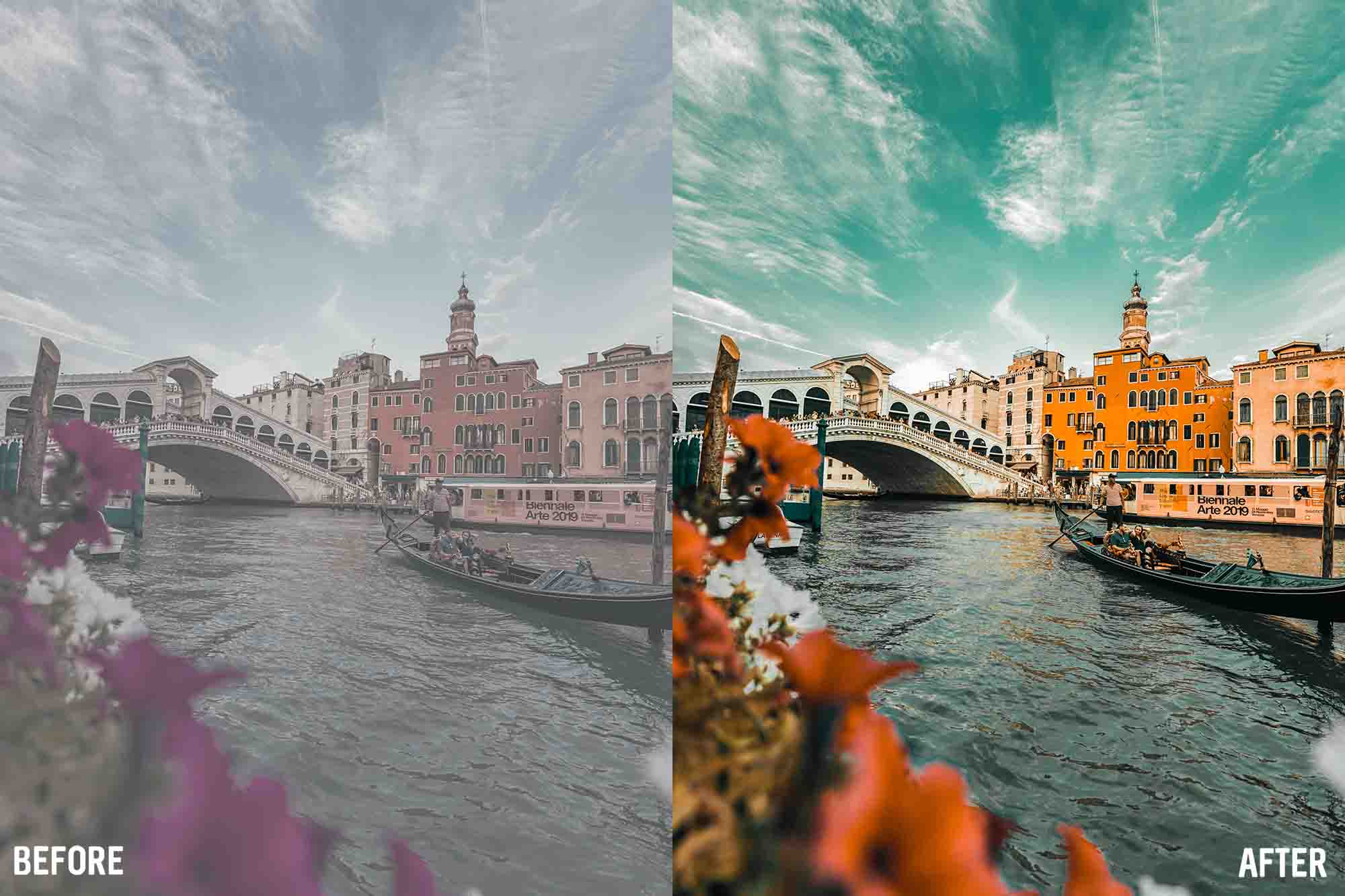
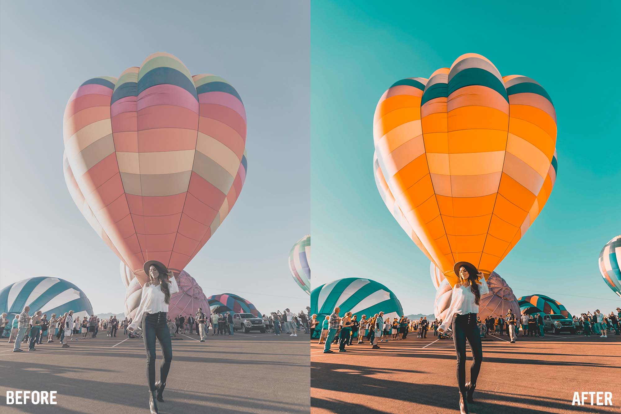
The Teal and Orange aesthetic remains dominant in Hollywood and YouTube alike. It's built on color theory: teal and orange are complementary colors, meaning they sit opposite each other on the color wheel. By pushing warm tones into the highlights (where skin typically sits) and cool teal tones into the shadows, you create maximum color contrast. This natural separation makes the subject pop against the background.
In the realm of photography, RAW files offer unparalleled flexibility. Unlike JPEGs, which bake in the camera's processing, RAW files contain all the uncompressed data captured by the sensor. This means you can rescue blown-out highlights or recover details from crushed shadows without introducing excessive noise. Using premium presets on RAW files maximizes their potential, providing a solid foundation for your signature look.
Editor's Tip: Always remember that the tools you use should empower your creativity, not restrict it. Experimentation is the key to discovering your unique visual signature.
Advanced Masking and Tracking - Part 7
When editing for social media platforms like Instagram or TikTok, keep in mind their compression algorithms. These platforms highly compress video, which can ruin delicate color gradients and introduce artifacting. It's often best to add a small amount of digital noise or grain to your final render; this forces the compression algorithm to allocate more bitrate to the image, preserving your color grade.
White balance isn't just a technical correction; it's a creative choice. While you generally want true whites, pushing the temperature slightly warmer can evoke feelings of nostalgia, summer, or intimacy. Conversely, cooling the image down can make a scene feel clinical, isolated, or suspenseful. Your presets should enhance these choices, not override them completely.
Halation and film grain are essential elements of film emulation. Digital sensors are incredibly sharp and clean, which can sometimes look sterile. By adding a subtle layer of organic grain and mimicking halation (the red glow around bright highlights typical of analog film), you can bridge the gap between digital perfection and analog character. Many high-end LUTs now incorporate these elements directly.
Editor's Tip: Always remember that the tools you use should empower your creativity, not restrict it. Experimentation is the key to discovering your unique visual signature.
To streamline your workflow, explore our Premium Collections. For further reading on industry standards, visit this external resource on filmmaking.
Film Emulation in the Digital Age - Part 8
Lighting is the foundation of all color grading. No LUT can fix bad lighting. Before you even think about post-production, ensure your set is lit intentionally. The ratio between your key light and fill light determines the contrast of the scene. If you shoot a scene completely flat with equal lighting everywhere, a LUT will struggle to add dimensional contrast.
Finally, remember that less is often more. The greatest compliment a colorist can receive is that the audience didn't notice the grade. The color should serve the story invisibly. If a viewer is distracted by how 'cool' the colors look, you may have pushed it too far. Always step away from your screen for 10 minutes, let your eyes rest, and then evaluate your grade with fresh eyes.
Skin tones are the anchor of any visual piece. Human eyes are incredibly sensitive to unnatural skin colors. A good rule of thumb is to check your vectorscope; there is a specific line designated for skin tones. Regardless of race or ethnicity, blood flowing beneath the skin means all humans fall on this exact same line. If your grade pushes the skin tones into the green or magenta spectrum, the audience will immediately sense that something is wrong.
Editor's Tip: Always remember that the tools you use should empower your creativity, not restrict it. Experimentation is the key to discovering your unique visual signature.
Efficient Batch Processing - Part 9
Batch editing is a lifesaver for wedding photographers and event videographers. When you have thousands of files from a single event, applying a consistent preset across the board ensures a cohesive narrative. However, batch editing isn't a one-click solution. You must still go through and manually adjust exposure and white balance for scenes where the lighting conditions changed drastically.
Color psychology plays a massive role in storytelling. Red can signify danger, passion, or urgency. Green can evoke nature, sickness, or the supernatural, depending on its hue and saturation. When applying a preset, ask yourself: does this color palette support the story I am trying to tell? A moody, desaturated preset might ruin a joyful wedding video, just as a bright, saturated look would ruin a horror short.
Organizing your LUT and preset library is essential for a fast workflow. Instead of endlessly scrolling through hundreds of options, categorize them by mood, lighting condition, or camera profile. Having a folder dedicated to 'Golden Hour,' 'Overcast,' and 'Indoor Studio' will save you countless hours over a year of editing.
Editor's Tip: Always remember that the tools you use should empower your creativity, not restrict it. Experimentation is the key to discovering your unique visual signature.

Preparing for Final Delivery - Part 10
Understanding color spaces is fundamental to modern editing. Whether you are dealing with Rec.709, Rec.2020, or a logarithmic profile like S-Log3, you need to know how data translates across these spaces. A conversion LUT transforms the flat, desaturated log footage into a standard viewing space. This is a technical step, not a creative one. Only after this transformation should you apply your creative grades.
Bit depth determines how much color information is stored in each pixel. 8-bit footage offers 256 shades per color channel, resulting in about 16.7 million colors. While this sounds like a lot, heavy grading can quickly cause banding in gradients like skies. 10-bit footage offers 1,024 shades per channel, giving over a billion colors. This massive increase provides the latitude needed for aggressive color manipulation.
Let's talk about contrast ratios. High contrast images have deep, crushed blacks and bright whites, creating a punchy, dramatic look. Low contrast images, often associated with the 'vintage film' or 'faded' aesthetic, lift the black point so shadows appear dark gray rather than pure black. Choosing the right contrast curve is just as important as choosing the right colors.
Editor's Tip: Always remember that the tools you use should empower your creativity, not restrict it. Experimentation is the key to discovering your unique visual signature.
To streamline your workflow, explore our Premium Collections. For further reading on industry standards, visit this external resource on filmmaking.
Conclusion and Next Steps
Thank you for reading this comprehensive 15-minute guide. Achieving a professional look takes practice, but with the right foundational knowledge and tools, it is entirely within your reach. We highly recommend browsing our shop for assets that can instantly elevate your work.
Comments (0)
Leave a Reply
Join the Discussion
You must have an account with us before you can leave a comment.
